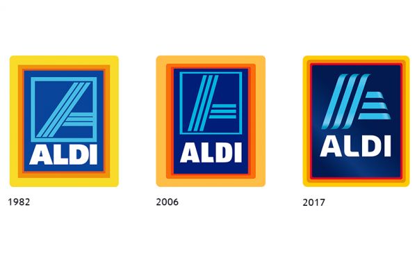
Aldi has relaunched its company logo with its first 'substantial change' since it was introduced in 1982.
Although, it tweaked its logo in 2006, this redesign marks the first time that the retail giant has made a notable change to its logo since the original version of the existing design was introduced.
A spokesperson for Aldi told Checkout, "Aldi has unveiled a brand new logo which will be rolled out as part of a world-wide refresh over the coming years."
The new logo slims down the old logo's bright borders, and adds shading and lighting effects to the stylised "A" at the centre of the logo. It also removes the blue frame around the central "A" and makes the lettering of the word "Aldi" less angular and dense.
The company will however retain its trademark colour palette. "The new logo uses Aldi’s trademark colours of red, blue, yellow and orange in a more dynamic and contemporary style," the retailer's spokesperson added.
© 2017 - Checkout Magazine by Donna Ahern


