Last month, Tesco lost its appeal in the Lidl yellow-circle branding case. Tesco was accused by the discount retailer of invoking its branding in its Clubcard promotion.
The court ruled that the yellow circle in a blue square was similar enough to Lidl’s logo to call to mind the discounter’s low prices as Tesco promoted its Clubcard scheme.
As a result, Tesco has been ordered to change its branding by 21 May – a move that could cost the supermarket giant up to £7 million.
Tesco has denied that the logos were derivative of those of Lidl.
It has now begun the process of changing the branding by maintaining the colours, but updating the layout of the design, opting for a blue square and yellow rectangle.
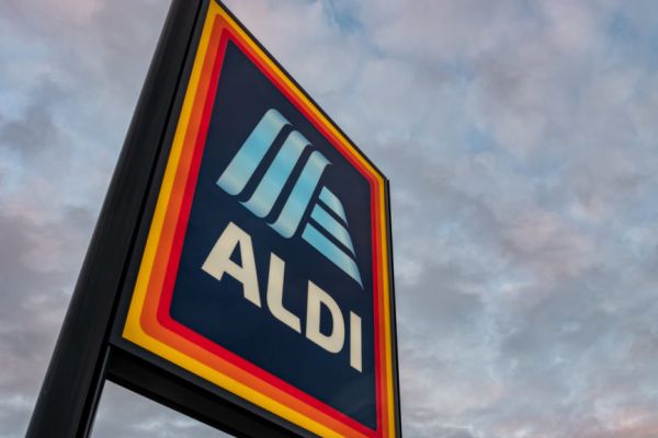
Fellow discounter Aldi uses similar colours to Lidl and the Tesco Clubcard material – blue and yellow.
There is an overlap of colour choice in other retailers as well: SuperValu and Tesco, Asda and Morrisons, Centra and Co-Op.
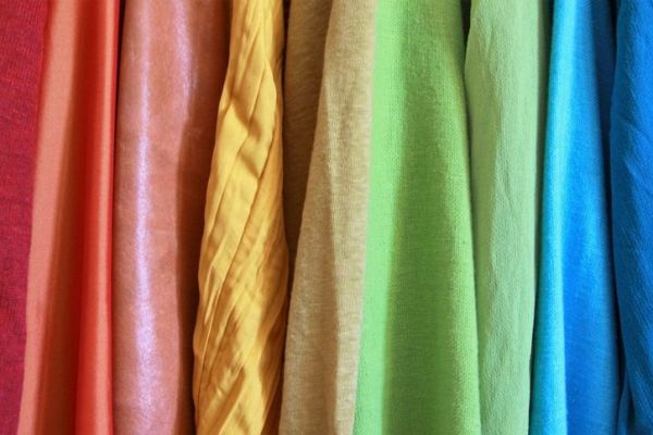
Marketers use colour to tell a story about their brands, so what are popular retailers trying to tell us with the colours that they use?
Blue And Yellow
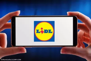
Within branding, blue is a trustworthy, calming colour. Retailers use blue to indicate that they are reliable stores and consistent in their practices.
Lidl and Aldi predominantly use blue in their branding, indicating consistency and reliability.
In the UK, the Co-Operative (Co-Op) also uses blue in its logo.
As the Co-Op is owned largely by its members, the blue provides a familiarity and trust between them and the business.
The use of yellow, seen in Lidl’s and Aldi’s logos, adds an eye-catching element to the marketing.
Centra has gone for a similar theme, with yellow text on a blue-green background.
Yellow is the first colour to which the human eye is drawn, so it can quickly catch consumers’ attention.
The colour also invokes optimism, clarity, warmth and positivity. Combining the bold yellow and calming blue invokes trust and optimism, for memorable retail branding.
Red

A more evocative colour, red is visceral, indicating bold, energetic and exciting branding.
SuperValu uses red and white in its branding, while Tesco’s logo is red and blue.
Both are known for their deals and low prices, with an emphasis on value and community.
The colour red is also thought to encourage people’s appetites, hence its use in fast-food restaurants, such as McDonald’s, KFC and Supermac’s.
Orange
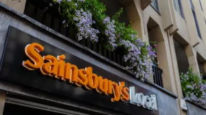
The main colour of Britain’s number-two supermarket, Sainsbury’s, orange evokes a friendly, cheerful, confident place.
Sainsbury’s orange logo indicates a welcoming store, a suggestion carried through by bright store design and consistent branding within the space.
Even the Nectar card speaks to the branding – customers are drawn to the retailer through the warm and cheerful colour, like bees to a bright flower.
Green
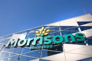
For harmony, health, nature and growth, UK retailers Asda and Morrisons use predominantly green in their branding.
In Morrisons, in particular, the subtle indication of growth is significant, as the retailer has its own production operations. It famously produces half of the fresh food that it sells.
Within the green branding, there is a suggestion of the freshness of food and the retailer’s proximity to the production line.
Black
Black invokes prestige, appearing serious, bold and classic all at once. It is a simple but always impactful colour.
Ireland’s top supermarket based on market share – Dunnes Stores – uses black in its branding.
Though the supermarket is a strong competitor on price in the Irish market, the branding indicates a level of glamour for the brand.
It’s Not All Rainbows
Though colours are a powerful tool for brands to use, they are not magic. Even the strongest branding in the world cannot create a reputation.
Elements such as price, location, stock and quality continue to be the driving force behind the retail sector – but it’s nice to see an array of colours telling us a story about the supermarket sector.
Read More: What Popular Drink Brands Can Teach Us About Brand Loyalty